

Colour plays a much bigger role in website design than most people think. While it may seem like a visual detail, colour directly impacts how visitors feel, interact, and respond to your content. The right colour choices can support usability, highlight important elements, and help establish trust, while the wrong ones can create confusion and even cause users to leave your site altogether.
Understanding Colour Theory
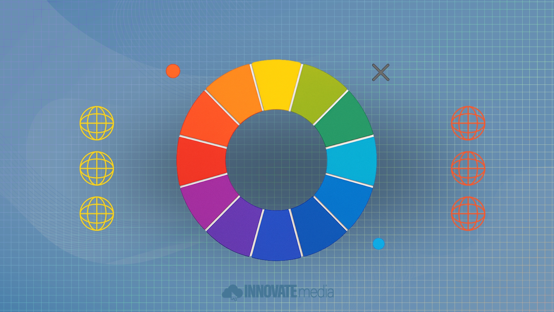
Colour theory is a set of guidelines that helps designers understand how colours work together and how they affect human perception. It includes the colour wheel, relationships between hues (such as complementary or analogous colours), and how to use combinations to evoke certain emotions or associations.
In web design, applying colour theory means choosing a colour palette that reflects your brand, functions well across devices, and supports navigation. A strategic palette can improve page SEO by enhancing usability and ensuring your content is more accessible and engaging to visitors.
Building a Colour Palette for the Web
Choosing the right colour palette is about more than just aesthetics—it’s about function. When creating or auditing a web page design, there are a few key components to consider:
1. Primary Colours
These represent your brand and should be used consistently across your site. They appear in headers, logos, buttons, and key visual elements.
2. Secondary Colours
Used to complement the primary colours, secondary tones provide visual contrast and help with hierarchy. These may be used in icons, backgrounds, or hover states.
3. Accent Colours
These are sparingly used colours meant to draw attention to CTAs, forms, or promotions. The best accent colours create contrast without overwhelming the layout.
4. Neutral Tones
Whites, greys, and blacks provide balance and readability. They are essential for spacing, text visibility, and overall design clarity.
Choosing web-safe colours and checking for accessibility standards—such as proper contrast ratios—ensures your site remains inclusive and functional for all users, including those with visual impairments.
Colour and User Experience
One of the most important roles of colour in responsive web design is guiding users through the interface. A well-thought-out palette can improve user experience by:
Signalling interactive elements (like buttons and links)
Organizing content with colour-coded sections
Creating a logical visual hierarchy
Reducing cognitive load by limiting unnecessary visual noise
For example, a consistent use of one colour for all clickable elements helps users understand where they can take action. On the other hand, inconsistent or overused colours may confuse the user and reduce engagement.
In modern frameworks built around flexible grids, colour can also help define rows, columns, or containers in subtle ways—making layouts easier to scan and navigate.
Emotion and Brand Messaging
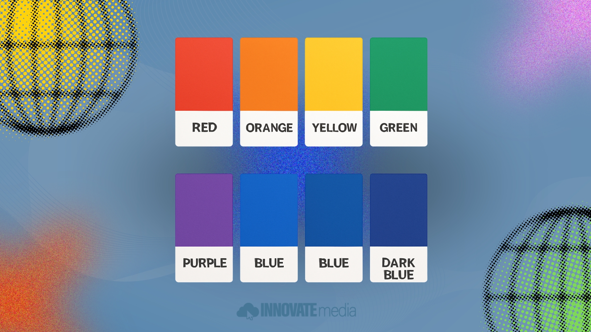
Colours carry emotional weight. Depending on the hue, saturation, and context, colours can affect how your brand is perceived.
Blue is calming and often associated with professionalism or trust (frequently used in tech and finance).
Red signals urgency, excitement, or caution—great for promotions or limited-time offers.
Green can signify growth, nature, or wealth.
Yellow evokes optimism but must be balanced to avoid readability issues.
These emotional cues help reinforce your messaging, especially on landing pages, mobile apps, or product highlights. For businesses investing in website development, the choice of colour can make the difference between a page that converts and one that gets overlooked.
Colour and Device Compatibility
Colours behave differently across screens, especially on mobile devices. What looks vibrant on a desktop may appear dull or oversaturated on a smartphone. This is why every palette should be tested across devices and screen resolutions during responsive web development.
Tools like Figma, Adobe XD, or a website builder with responsive preview modes help designers check how colour appears across breakpoints. Pairing this with a viewport meta tag ensures mobile compatibility and a smooth, mobile friendly experience.
Maintaining contrast and clarity across all screen sizes isn’t just good design—it improves readability, accessibility, and ultimately your search engine optimisation efforts.
Colour and Technical SEO
While colour itself isn’t a ranking factor, it impacts key metrics that search engines value:
Bounce rate: Poor colour choices can lead to hard-to-read text or a cluttered layout, causing users to leave.
Time on page: A visually pleasing palette keeps users engaged longer.
Navigation clarity: Colour-coded sections or menus improve interaction, which can indirectly influence SEO signals.
Colours also influence the effectiveness of your meta descriptions, as the content they promote needs to align with the landing page it leads to. If the ad or search snippet leads to a visually jarring or inconsistent colour scheme, users may bounce immediately.
Conducting a site audit that includes visual hierarchy and colour analysis helps identify these issues early and correct them before they affect performance.
Industry Influence and Design Trends
Colour use in web design continues to evolve. While early internet pages were often limited to safe colour choices and simple gradients, today’s capabilities allow for far more creative and brand-driven palettes.
Following web design trends can help keep your site feeling modern. Examples include:
Muted, earthy tones to support sustainable or wellness brands
Neon accents in tech or fashion sectors for an energetic edge
Monochromatic schemes with bold typography to create drama and focus
Gradient overlays that add depth to flat layouts without relying on images
The key is balance—trendy doesn’t mean effective unless it aligns with your audience and your goals. As Ethan Marcotte once noted in his work on responsive web design, adapting layout and visuals to context is at the heart of creating meaningful experiences.
Colour Best Practices for Web Design
To ensure colour supports, rather than hinders, your web presence, follow these best practices:
Limit Your Palette
Stick to 3–5 core colours to maintain focus and visual harmony.
Use Contrast Wisely
Make sure there’s enough contrast between background and text for readability.
Test Across Devices
Check how colours appear on desktops, tablets, and smartphones.
Keep Accessibility in Mind
Use tools to verify that your site meets WCAG standards for contrast and colour blindness.
Align With Brand Strategy
Every colour should reinforce your business values and tone.
Build Better With Colour
Colour theory isn’t just for artists—it’s a practical tool for better website design. Whether you’re redesigning your brand, launching a new site, or working with the Innovate Media design team, understanding colour’s role can help you make smarter, more impactful decisions.
From building a cohesive colour palette to ensuring a seamless user experience, colour supports both visual appeal and performance. As part of your ongoing website development or page SEO efforts, never underestimate the power of colour to influence how users feel, engage, and act.
A well-designed site doesn’t just look good—it performs well. And colour plays a big role in both.